Loving the use of typography and clean lines in this stunningly simple, yet beautiful logo design & brand identity created for Yashiki by @giadatamborrinostudio.
Read MoreApproximately 130 km south of Cancun lies a long, spectacular coastline, where paradise meets Mayan mysticism, and hippie hedonism reigns supreme.
Read MoreThe @nytimes are often on point with their advertising. Here, @veritewoman spotlighted their banging campaign billboard in New York City. The truth is more important now then ever.
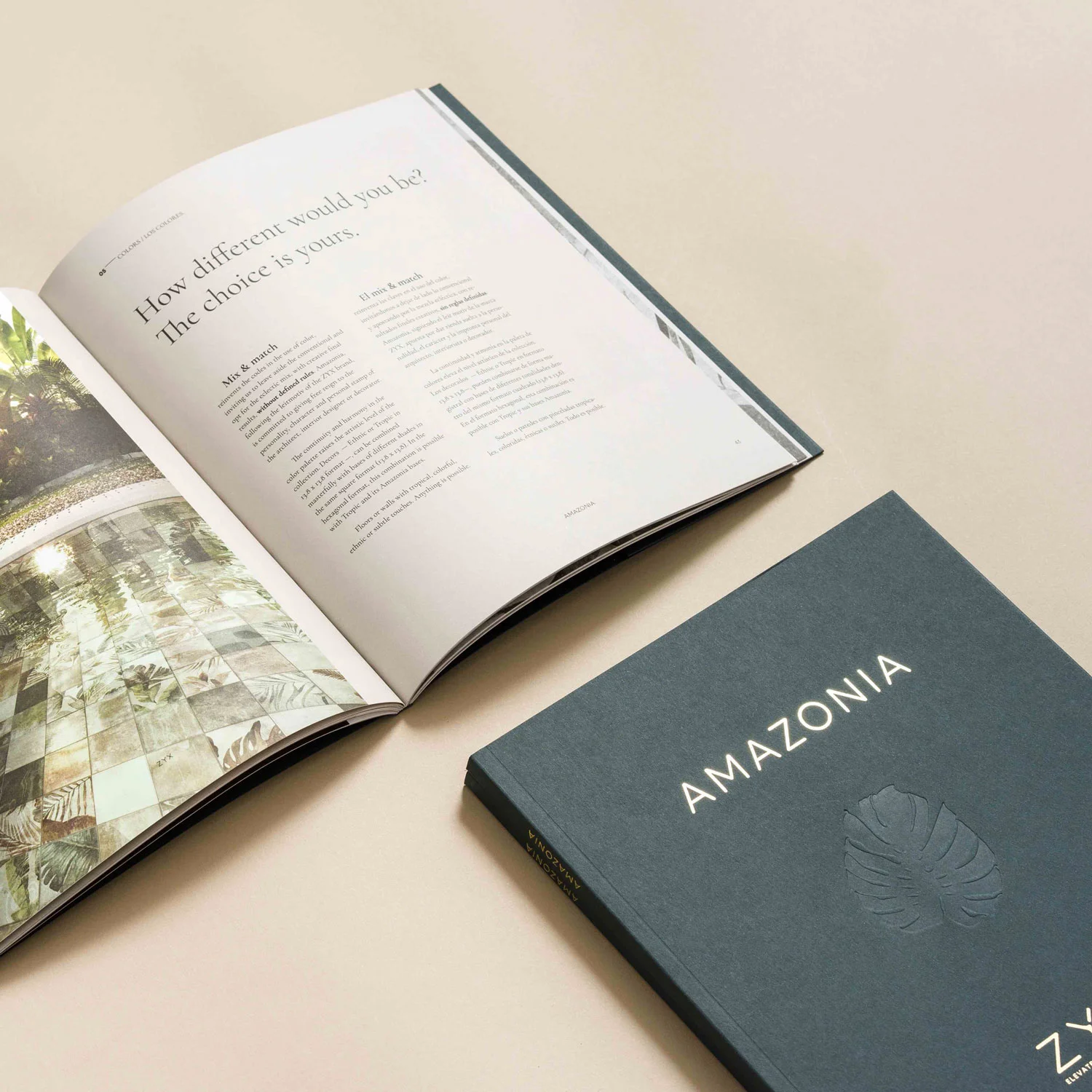
Read MoreA beautiful selection of photography & typography, matched by subtle details on an earthy yet luxurious colour palette make this catalogue for architects and interior designers a must have. Designed by @idearideas.
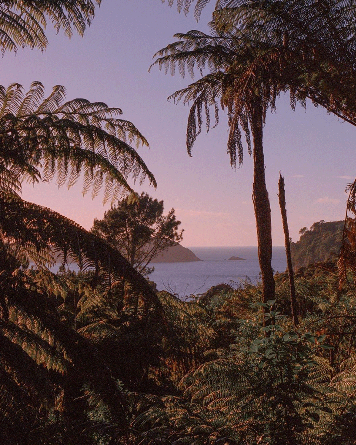
Read More@shadowontherun shoots a lot of her work on film, including this beauty taken in New Zealand. Loving how the light hits the tips of the leaves, almost carrying the sunset all the way to the viewer.
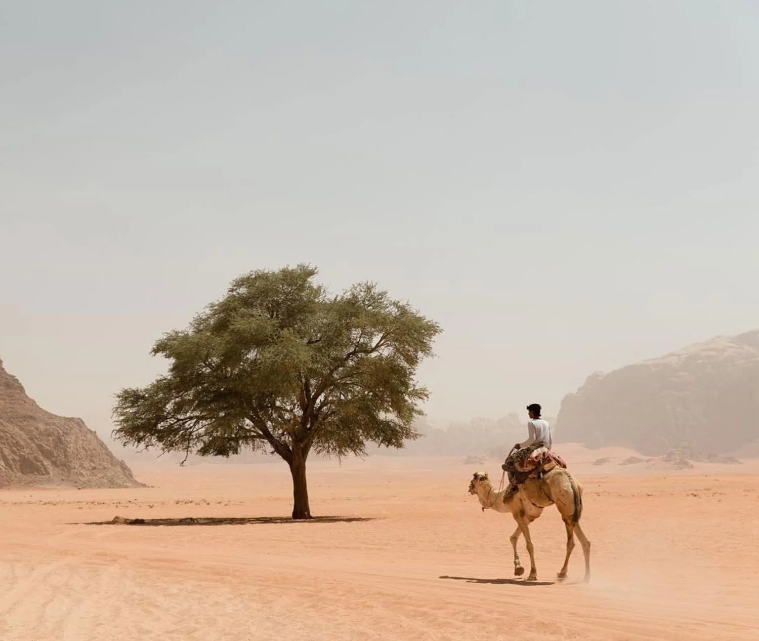
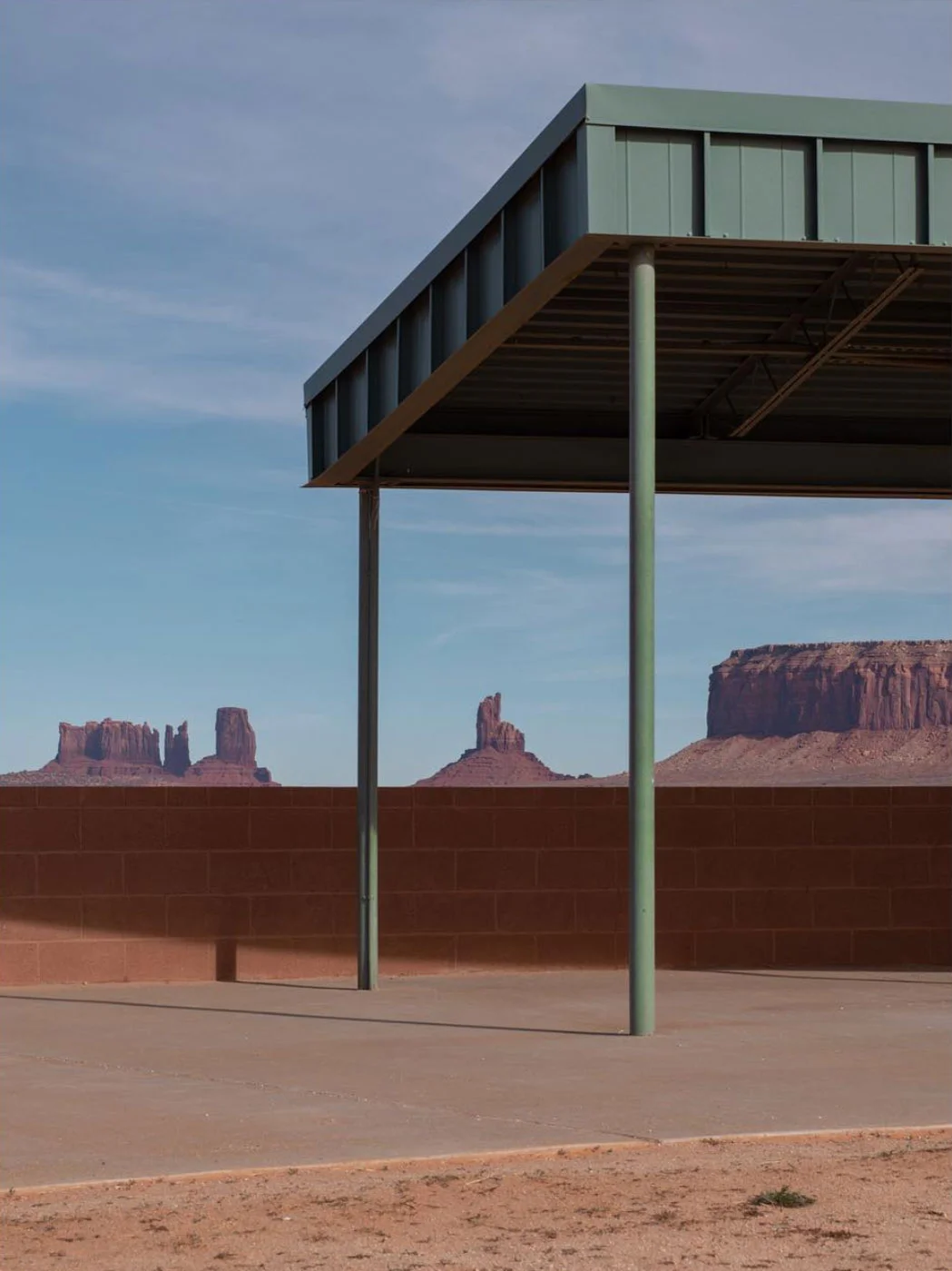
Read More@mattcherub is absolutely on point with his tones in this photo. The colour of the desert sand, the misty blue sky and the dusty green tree all compliment each other beautifully.
Read MoreToday we’re looking back on one of our dearest projects to date, the creation of MUSE Magazine, an independent women’s magazine merging intelligent journalism with an international sensibility. Here we highlight our Editorial Director’s article Smoke & Mirrors.
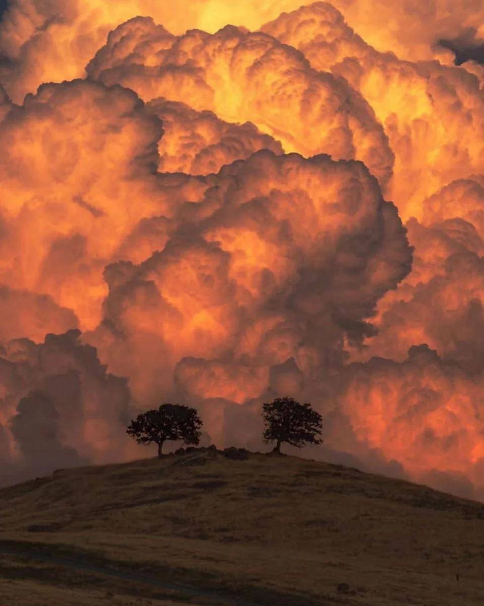
Read MoreTowering thunder clouds forming over the sierras by @a_guy_named_eric. Welcome to the weekend.
Read MoreAnother Wes Anderson-esque selection today. @dinokuznik “wonders around with pockets full of film” and his beautiful selection of photography takes us back a few decades to some truly stunning scenes.
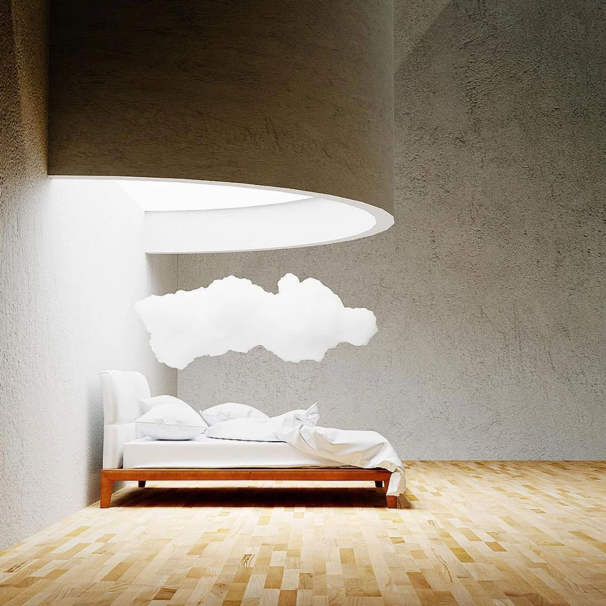
Read More☁ dreamroom ☁ by @filmdecay_. Follow him for amazing concept inspiration.
Read MoreDigging this simple yet elegant Media Kit, designed by @madebystudiostandard. They nailed the authenticity of it, giving enough information, capturing the imagination, all while keeping it slick and beautiful with their use of typography and image selection.
Read MoreWe can’t tell how @chrisconnolly’s composite makes us feel. On one side you have the free form of the ocean, on the other the low ceiling confines the space, making it claustrophobic. But hey, it’s Monday, don’t over think it.
Read MoreGerman artist Simon Schubert (@studiosimonschubert) creates intricate interior portraits of 19th century buildings by meticulously folding and pressing plain white paper.
Read MoreAs our Editorial Director, Daniela Aroche, jets off to NYC for a client campaign, we’re imagining her in this dreamy airport architecture render by multidisciplinary artist @filmdecay_.
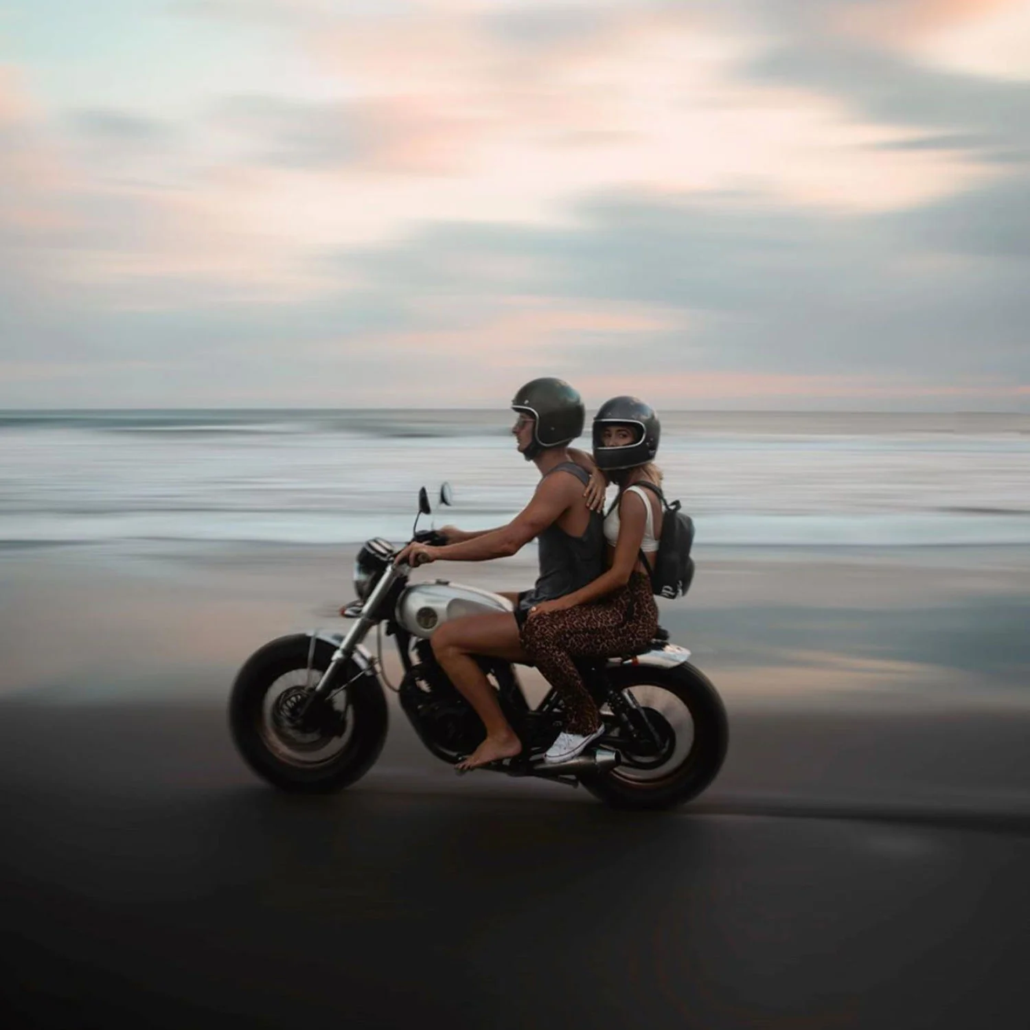
Read More@gypsea_lust has us dreaming of the open road (or empty beach). With the weekend fast approaching, we can’t think of anything better than riding shoeless on a fresh motorbike, with your partner in crime in tow.
Read MoreAdmiring the beautiful work of @kindworldwide in their dark and delicate branding for Babord. The use of salmon pink details laid out on a northern seas green background personifies their client’s work and location perfectly.
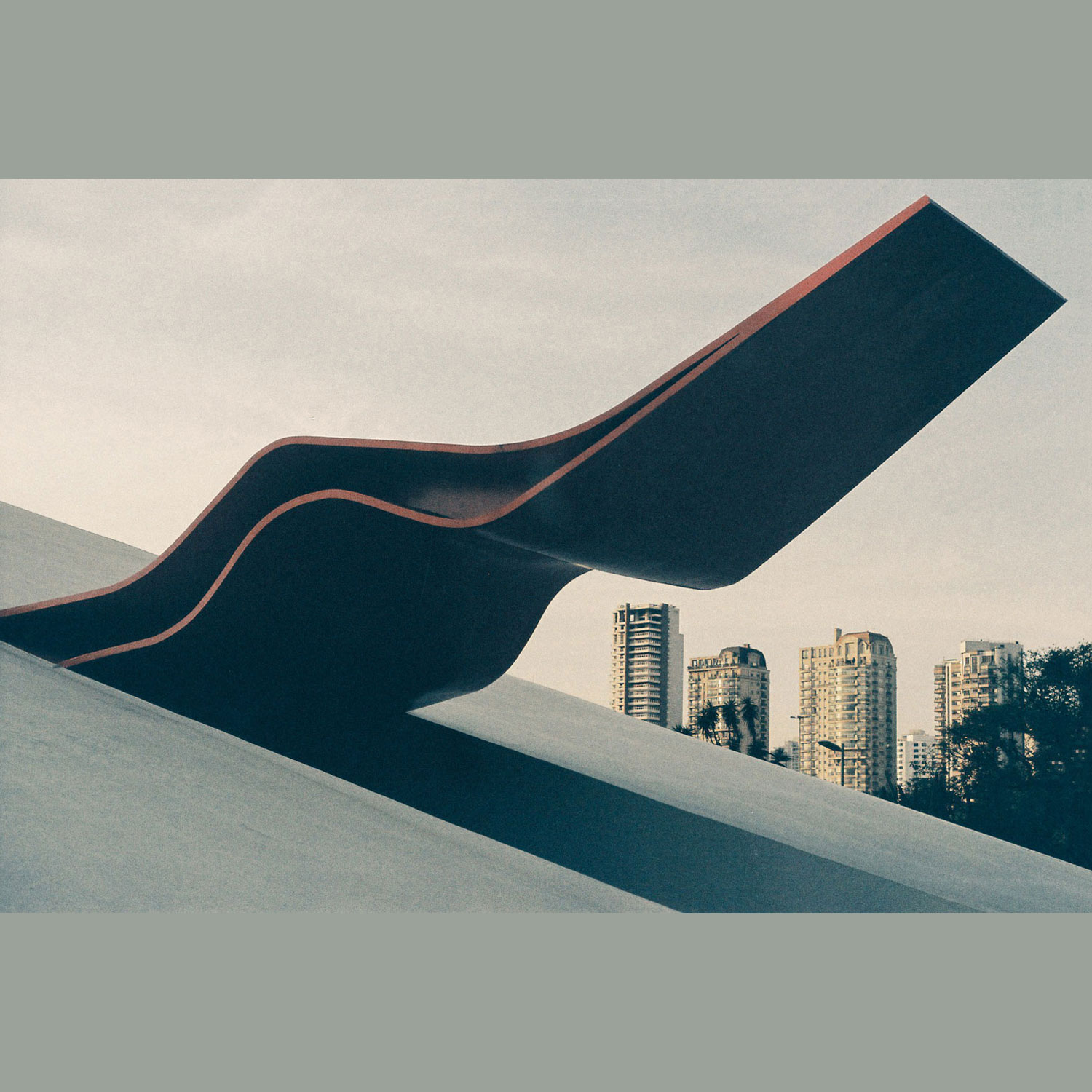
Read MoreWe’re midweek and going with the flow this Wednesday morning. Enjoy the ride with our Creative Director’s photo (@rhodri_jnr) from the Ibirapuera Park in São Paulo, Brazil. #filmisnotdead
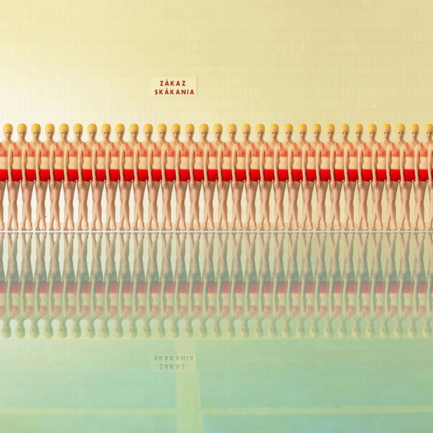
Read MoreCheck out @maria.svarbova for some truly Wes Anderson style inspiration. “In the Swimming Pool is Maria's largest series yet, originating in 2014 and continuing to develop to date. Sparked by a hunt for interesting location, her fascination with the space of public swimming pools contributed to developing her visual style.”
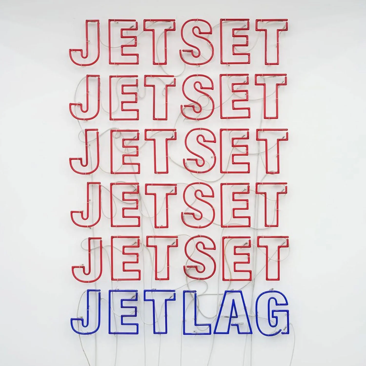
Read More@eikekoenig encapsulates our lifestyle to a tee. Hopefully one day his neon artwork will decorate our Paris office.
Read More

